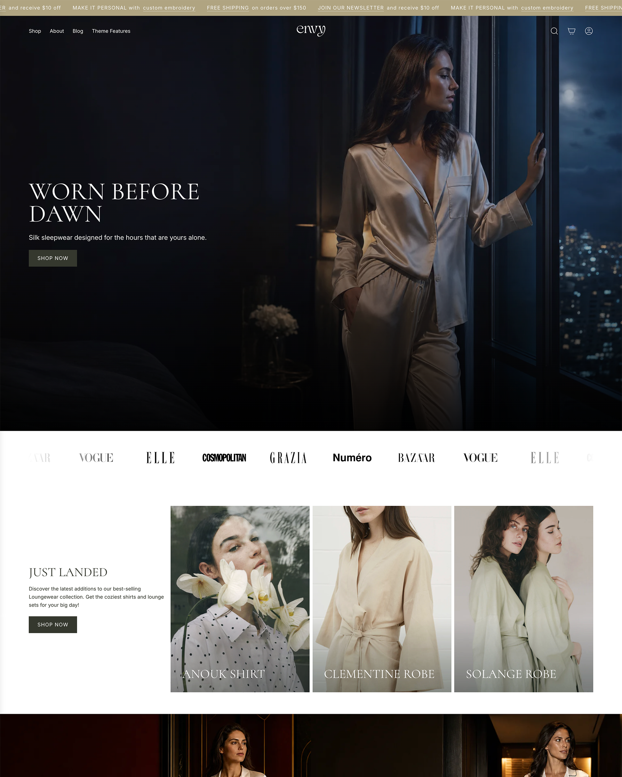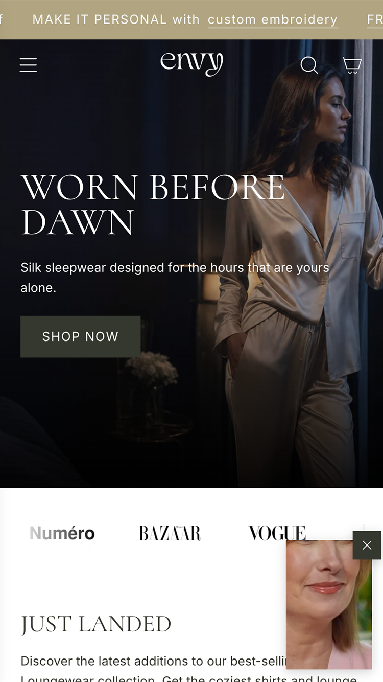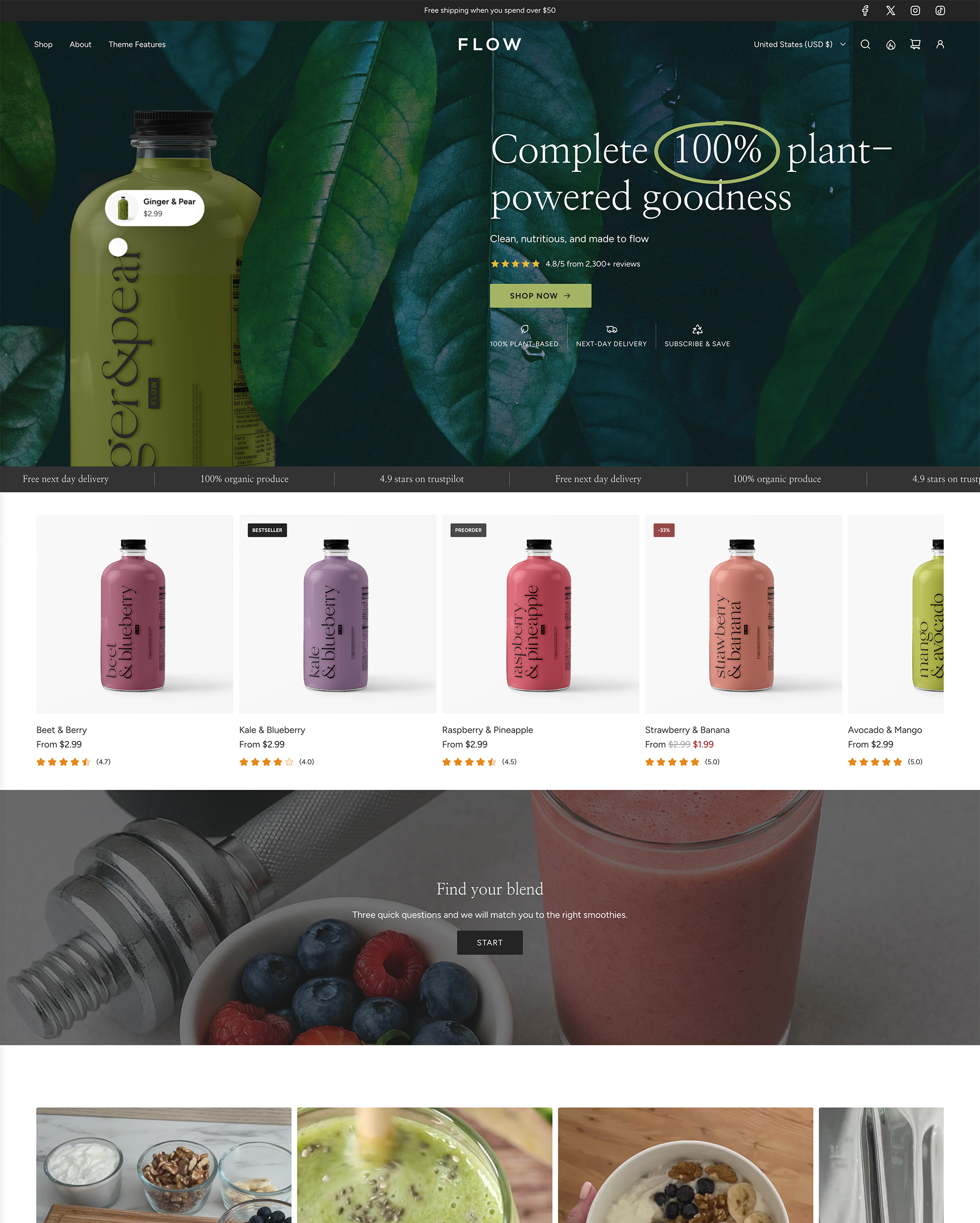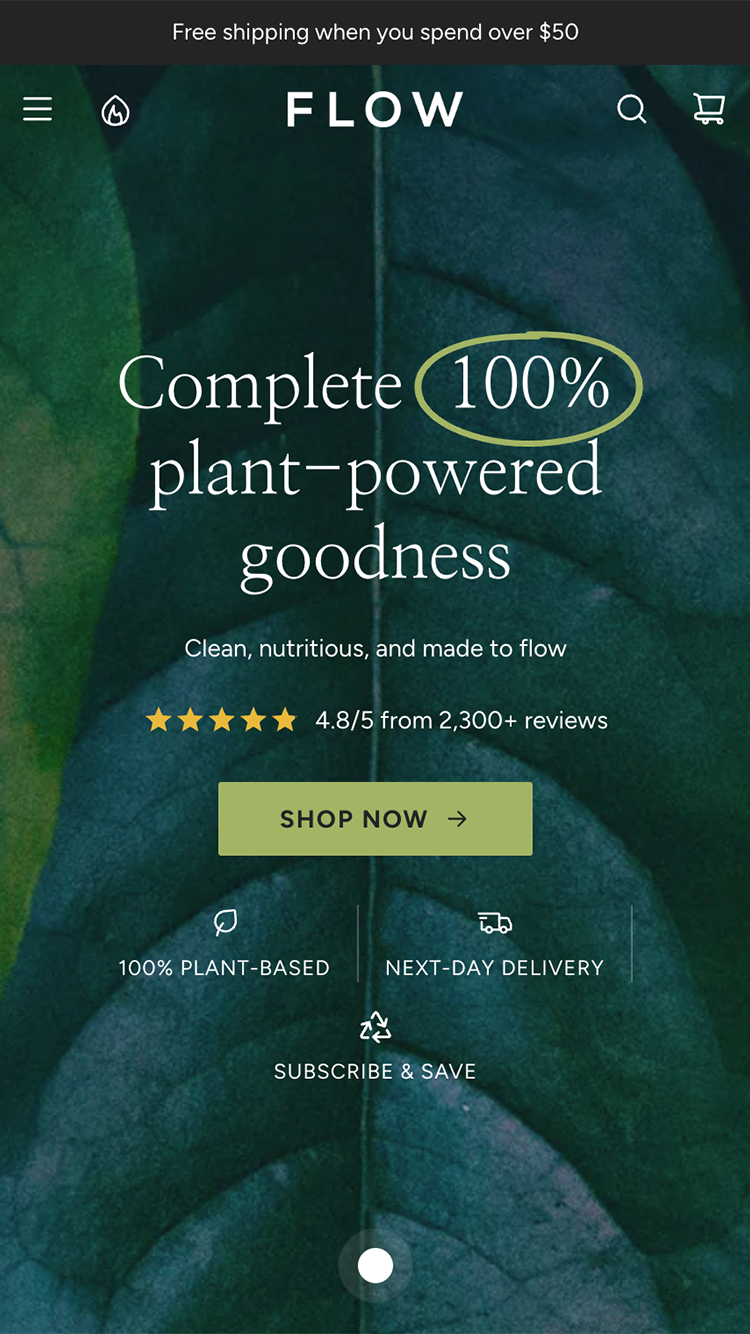

A store is full of colour already. It arrives in the product photography, and it changes with every collection. The interface around it has one job: stay out of the way, and point. That pointing is what your accent colour is for, and it works in proportion to how rarely you use it.
Give the accent one meaning
Act here. The add-to-cart button, the primary link, the one badge that matters. When the accent means one thing, customers learn it in a page. When it also means headings, borders, icons and the newsletter box, it means nothing.
One accent colour, and it means one thing: act here.
Let neutrals carry the page
Backgrounds, text, borders, dividers: a warm or cool grey family, chosen once, used everywhere. This is most of the design. It is also the part that makes photography look expensive, because nothing around it competes.
Count the accent on a page
Three appearances is plenty. Past three, you are decorating, and the button that needs to be found is losing its advantage to a border that does not.
Take the accent from the brand, not the mood
The accent should come from the logo or the packaging, so the store and the box that arrives are recognisably the same thing. Seasonal colour belongs in the photography and the campaign section, not in the buttons.
Check it on the product page
Open a product with strong colour in the photograph. If the accent fights it, the accent is too saturated or too frequent. The product wins that argument every time; the interface should have conceded before it started.
Neutrals do the work. The accent points.