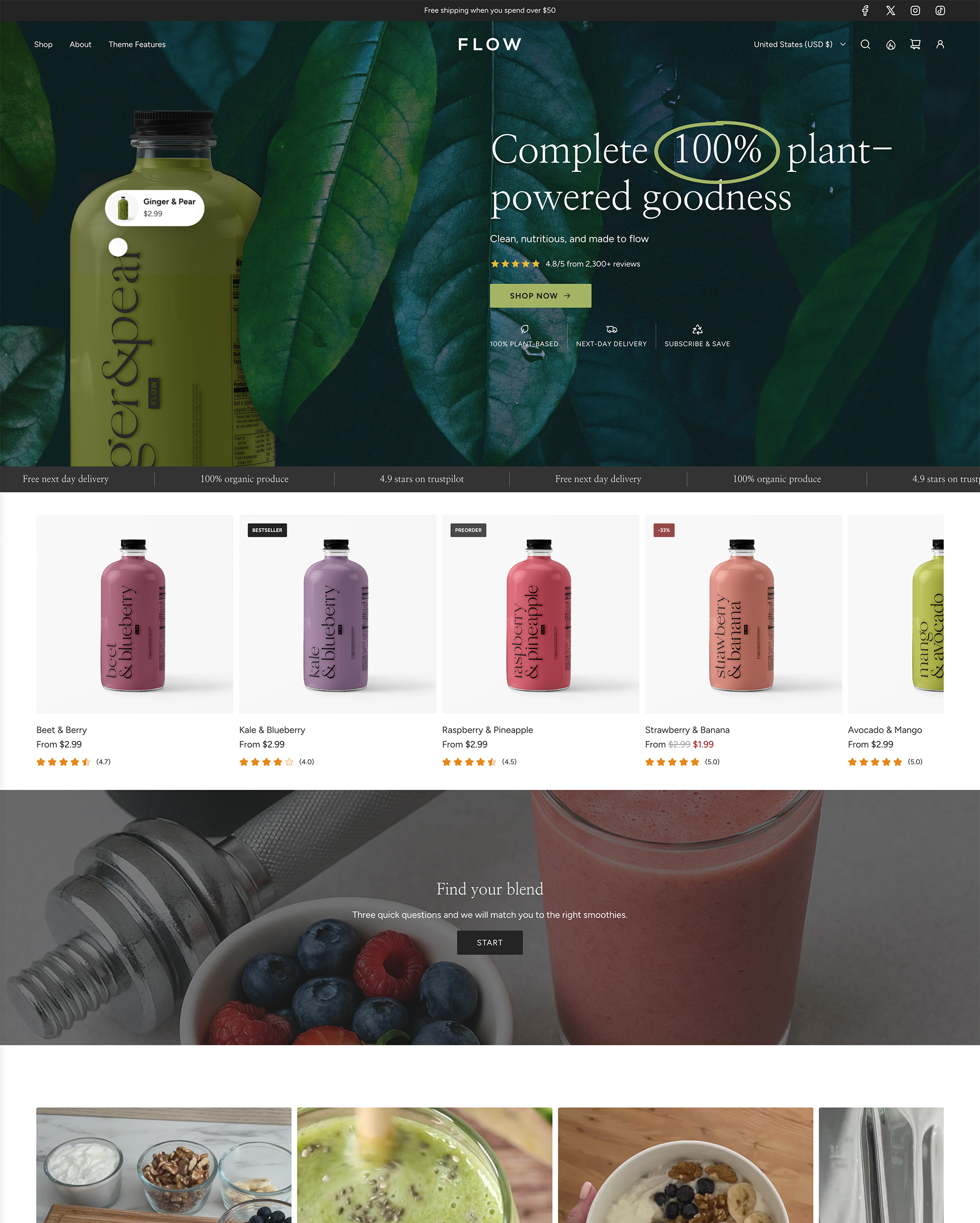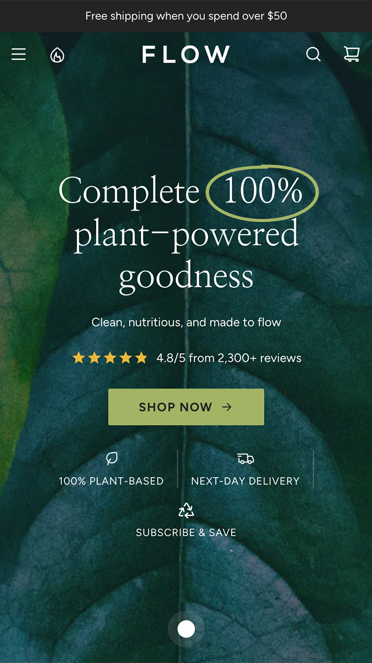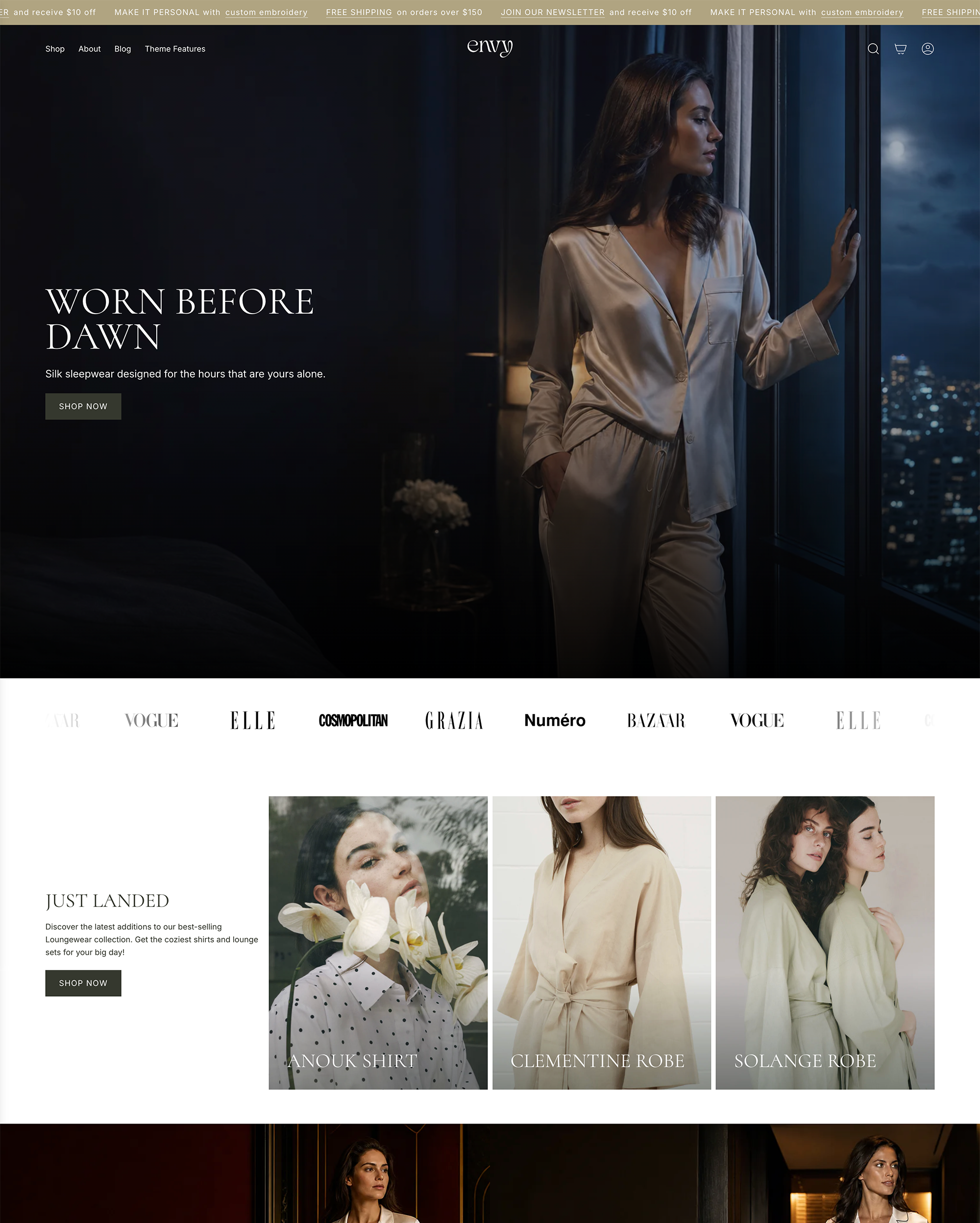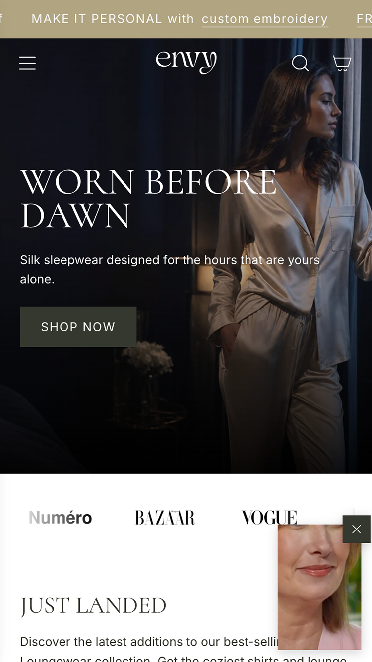

A homepage that tries to show everything sells nothing. Every extra section is a request for attention, and attention is the only thing a new visitor has not yet given you.
Decide what the one click is. For most stores it is a collection or a hero product. For a brand with a story, it might be the story. Whatever it is, the top of the page exists to earn that click, and everything below it exists to earn it from the people who scrolled past.
Lead with the product, not the mood
Lifestyle photography sets a tone. A product photograph makes a promise. Above the fold you need both, and the product wins the argument. If a first-time visitor cannot tell what you sell within two seconds, the mood cost too much.
If they can't tell what you sell in two seconds, you've paid for a mood, not a sale.
One headline, written by someone who has read the reviews
Your customers have already written your headline. It is in the reviews, in the words they use to explain why they came back. Take the most repeated benefit and set it in your largest type. Skip the manifesto.
Cut the carousel
Nobody waits for slide two. A carousel is a way of avoiding a decision about what matters most. Make the decision. One image, one message, one button.
Order the page by certainty
Bestsellers first, because they have already proved themselves. New arrivals second, because they reward the repeat visitor. Everything else, including your brand story, comes after the point where someone could have bought something.
Give the bottom of the page a job too
People who reach the footer are interested and undecided. Answer the questions that stop people buying: shipping, returns, sizing, where you are based. Plainly, in a sentence each. It converts better than another row of products.
Bestsellers first. They have already done the persuading.