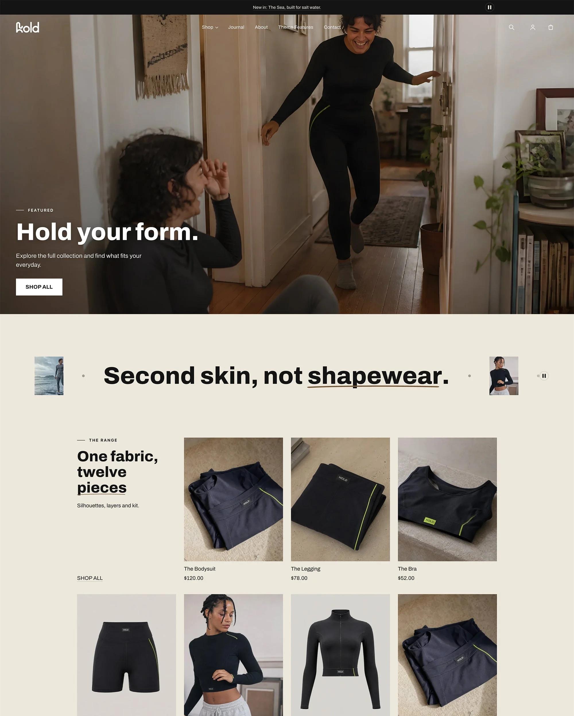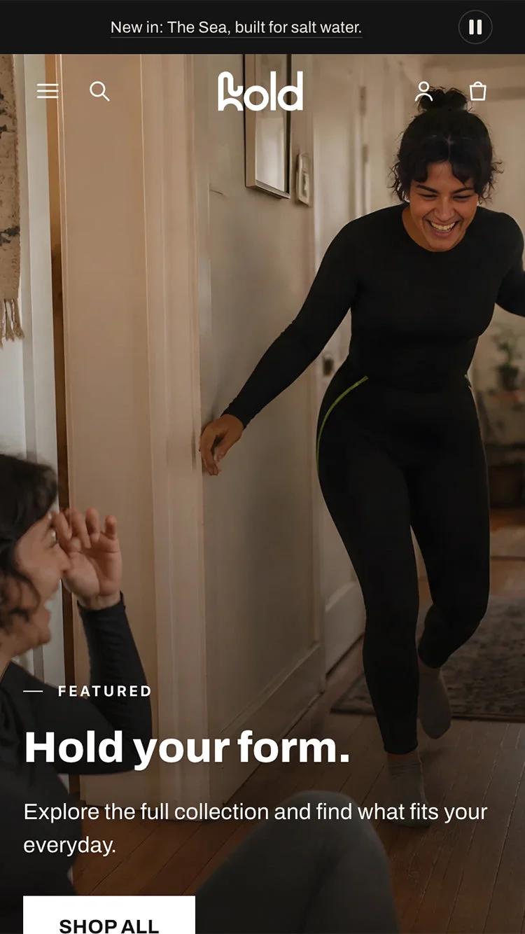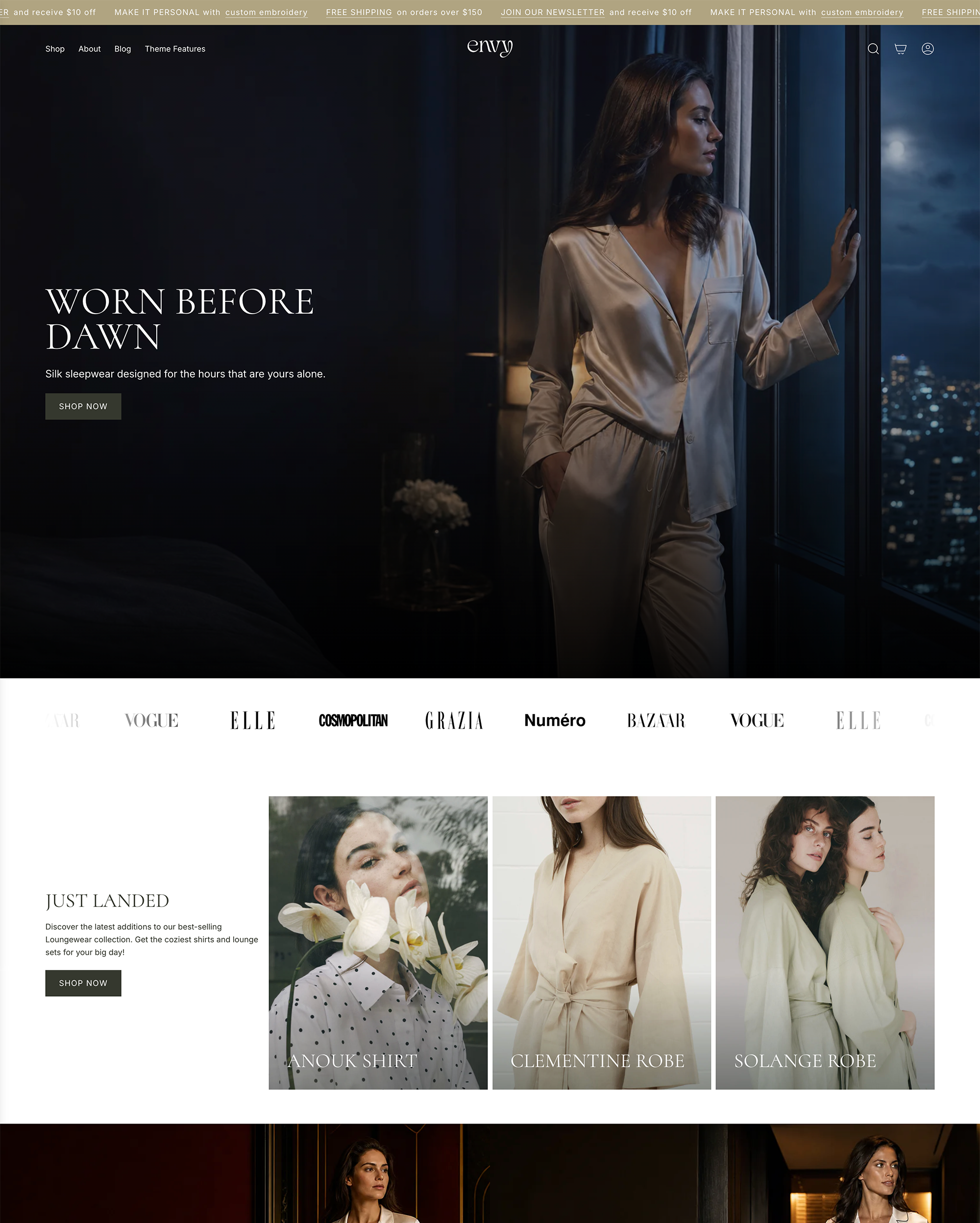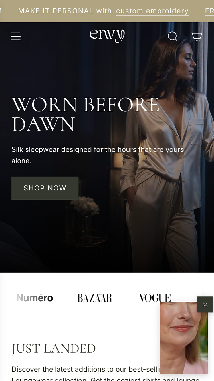

Search results, ads, a link from a friend: most first visits arrive on a collection page. The homepage is a front door most of your customers walk past. The collection page is the one they use, and it is usually the least designed page in the store.
Say what this is, in one line
A collection needs a title and one sentence of intent: what these products are, and who they are for. Not a banner. Not a paragraph of keywords. Someone who arrived from a search should know within a second that they are in the right place.
Every tile has three jobs
The product, the price and one reason to click. A second photograph on hover if you have it. A badge only if it means something: new, low stock, a real saving. Anything more turns a grid into a wall.
Show the product, the price and one reason to click. Nothing else.
Order by what sells
Bestsellers first, because the collection page is where people decide whether your store is for them, and proof is more persuasive than novelty. New arrivals second. Let the filters take it from there.
Filters are for the shopper's words
Size, colour, price, and whatever your customers actually ask for: dietary need, material, fit, occasion. Five filters that match how people think beat twenty that match your spreadsheet.
Give the page an end
Nobody should reach the bottom of a collection and find only a footer. Add the next collection, a short buying guide, or the two questions people always ask before they choose. The end of the grid is where the undecided are.
The collection page is the front door your customers actually use.